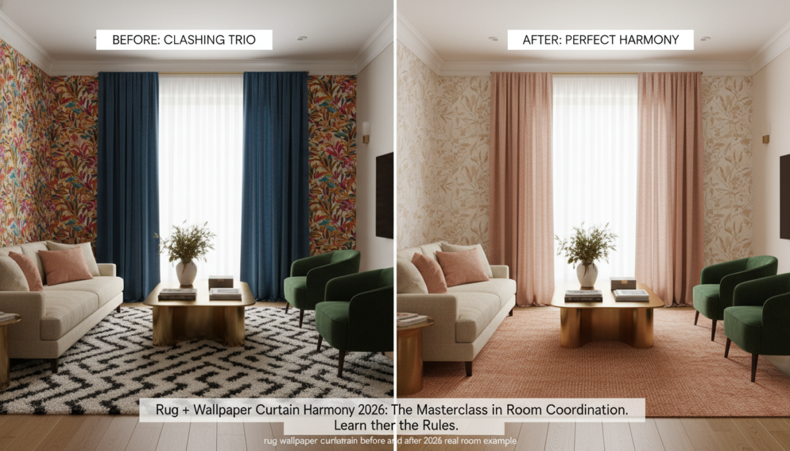

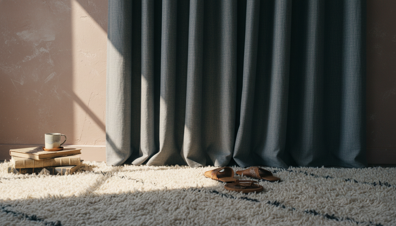
Achieving the perfect Rug + Wallpaper synergy is often the final hurdle that separates a cluttered room from a curated masterpiece. In 2026, the interior design landscape has shifted away from matchy-matchy sets toward a more sophisticated, layered approach where textures and undertones do the heavy lifting. The frustration is universal: you fall in love with a bold botanical wallpaper, pair it with velvet drapes, and suddenly, the rug you thought was ‘neutral’ looks like a jarring afterthought. This guide dismantles the mystery of coordinating the three largest surfaces in your home. By understanding the interplay of vertical and horizontal planes, we will transform your space into a cohesive sanctuary using the exact strategies employed by the world’s most elite designers.
“To coordinate a rug with wallpaper and curtains in 2026, follow the 60-30-10 rule for color distribution and ensure all three elements share the same temperature (warm or cool) undertone. If your wallpaper features a large-scale pattern, choose a solid or subtly textured rug to ground the space. Conversely, if your walls and curtains are neutral, use a statement rug to act as the focal point. Always layer your physical swatches in natural light to confirm that the textures—such as linen, wool, and silk—complement rather than compete with one another.”
The Roadmap
Table of Contents
- The Psychology of Triple-Element Harmony in 2026
- Rule 1: Decoding Undertones Over Surface Colors
- Rule 2: Balancing the Scale of Pattern and Print
- Rule 3: Texture as the Visual Bridge
- Rule 4: Establishing Your Hero Element
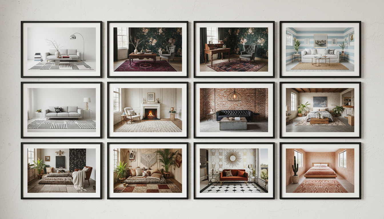
- 8 Real-World Harmony Transformations
- The 2026 Harmony Decision Matrix
- Common Coordination Pitfalls and Professional Fixes
- Frequently Asked Questions
The Architecture of Visual Cohesion: Why the Trio Matters
The Power of the Visual Anchor
- Depth vs. Flatness: A textured rug provides a “base note” that allows delicate wallpaper patterns to sing without feeling frantic.
- Spatial Perception: Using a rug that shares a color family with your curtains creates a “wrap-around” effect, making smaller rooms feel significantly more expansive.
- Acoustic Warmth: Beyond aesthetics, the trio of rug, wallpaper, and curtains serves as the primary sound-absorption system of the home, creating that “expensive” quietness found in luxury hotels.
To avoid visual overwhelm, assign your “hero” pattern to one of the three elements (usually the wallpaper or the rug). Let the second element provide a secondary texture (like a ribbed curtain), and ensure the third element is a “grounding neutral” that shares an identical undertone with the hero. For example, if your walls are a Sage Green with a 40 LRV, your rug should ideally sit within two shades of that same tonal family to maintain a sophisticated flow.
Mastering the Undertone: The Secret Language of 2026 Design
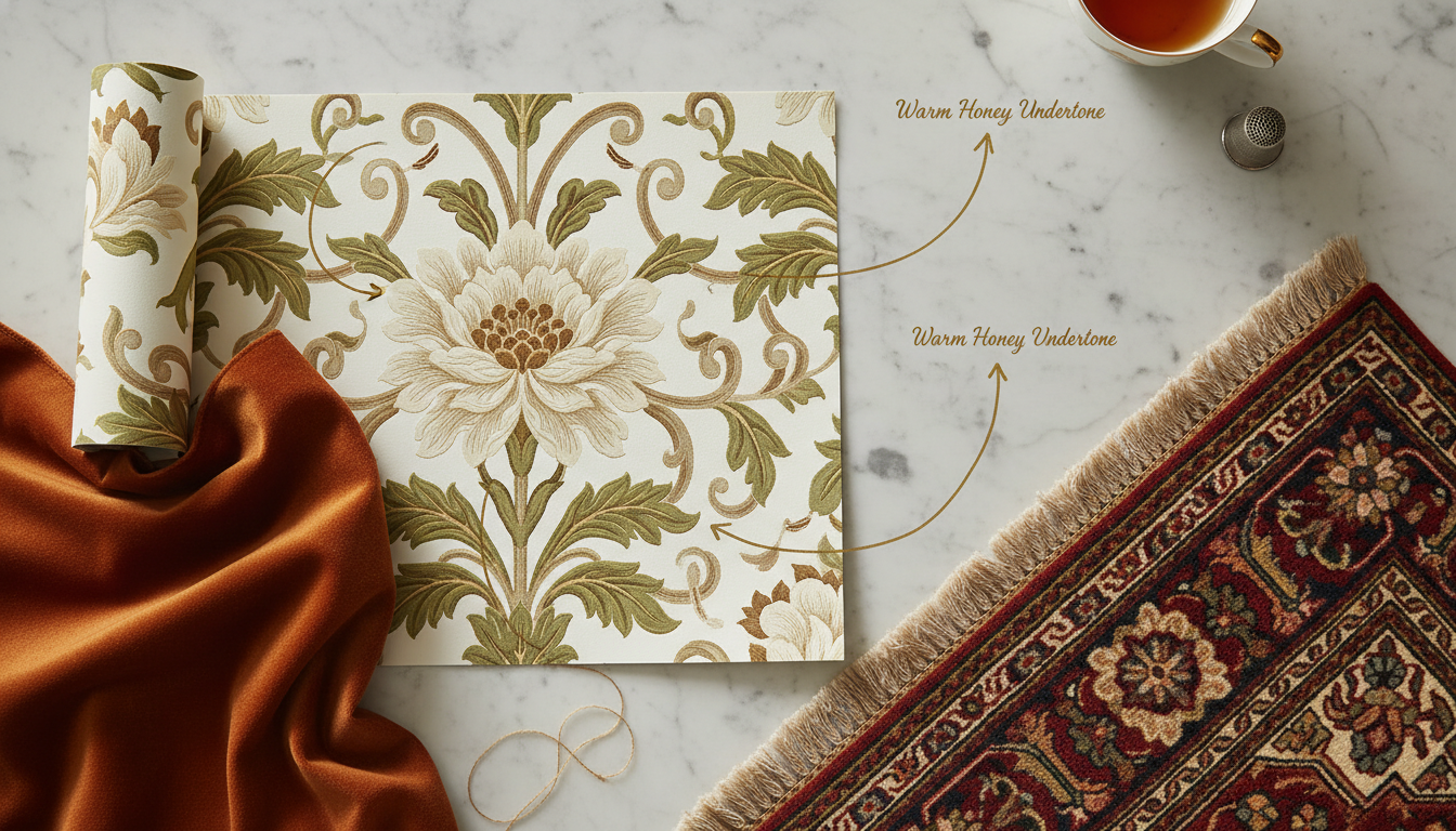
The Invisible Thread: Deciphering Undertones Across Three Surfaces
The most common design heartbreak happens in the transition from the mood board to the living room. You’ve selected a stunning forest green wallpaper and paired it with deep emerald velvet curtains, yet when the rug arrives, the entire room feels “off.” The culprit isn’t the color—it’s the undertone. In 2026, we are moving away from the era of “matching” and into the era of “tonal alignment.”
Every pigment has a temperature. A “neutral” beige wallpaper might have a pink (warm) or green (cool) base. If you pair a pink-undertone wallpaper with a yellow-undertone jute rug from thebohorugs.com, the surfaces will visually “vibrate” against each other, creating a sense of unrest. To achieve that seamless, high-end gallery look, you must identify the primary temperature of your walls and curtains before the rug ever enters the conversation.
“The secret to the 2026 aesthetic is understanding Metamerism,” says Julianne Thorne, Senior Textile Curator. “This is the way colors change under different light sources. A rug that looks perfect in a showroom might turn muddy when placed against a wallpaper with a high Light Reflectance Value (LRV). You aren’t just matching fabrics; you are managing how light bounces between the vertical walls and the horizontal floor.”
- The Cool Spectrum: If your curtains feature crisp linens or blues with silver threads, look for rugs with grey, blue, or lavender bases.
- The Warm Spectrum: For walls painted in the “New Terracotta” or “Oatmeal” shades trending for 2026, choose rugs with gold, red, or clay-based fibers to anchor the space.
- The Neutral Bridge: If you are mixing temperatures, use a hand-knotted rug that incorporates both warm and cool wools—a technique often found in artisanal Turkish weaves—to act as a peacemaker between cool walls and warm window treatments.
Before committing to a large-scale rug, pin your wallpaper and curtain swatches to a board and place them vertically against your wall. Lay your rug sample flat on the floor beneath them. Observe them at 5:00 PM when the natural light begins to fade. If the rug appears “dirty” while the wallpaper remains “crisp,” the undertones are clashing. A truly harmonious trio will deepen in richness together as the sun sets.
Balancing the Visual Weight: Pattern Scale and the 60-30-10 Rule
In 2026, we are seeing a resurgence of maximalism, but with a disciplined edge. The “Rule of Three” applies perfectly to the rug, wall, and window relationship. To prevent the room from feeling like a Victorian costume shop, you must vary the scale of your patterns. If your wallpaper features a large-scale botanical print, your curtains should ideally be a solid or a micro-texture, allowing the rug to provide a medium-scale geometric grounding.
The 60-30-10 distribution is your roadmap to professional-grade harmony:
- 60% (The Walls): Your largest surface area. Whether it’s a limewash finish or a subtle textured wallpaper, this sets the atmospheric tone.
- 30% (The Rug): The visual anchor. In a room with bold walls, a neutral, high-pile wool rug from an artisanal collection provides the necessary “white space” for the eyes to rest.
- 10% (The Curtains): The accent. This is where you can pull a secondary color from the rug’s weave to create a vertical-to-horizontal connection.
Texture as the Bridge: When Color Isn’t Enough
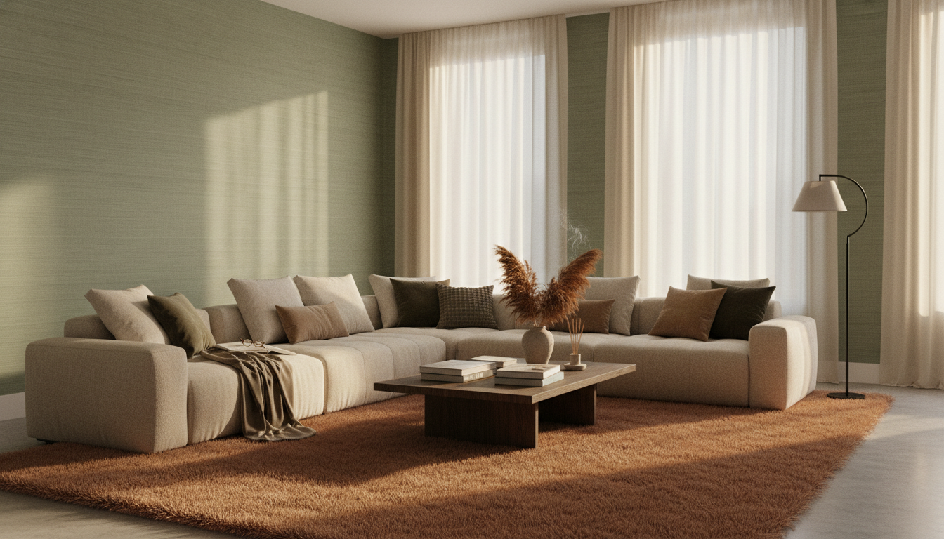
Sometimes, the most sophisticated rooms are monochromatic. When you are working with a “Quiet Luxury” palette—think creams, sands, and fossils—the harmony is found in tactile contrast. If your walls have the smooth, matte finish of high-end mineral paint and your curtains are a heavy, flat-weave wool, your rug needs to introduce a new sensation.
Consider a 2026 favorite: the Bio-Acetate and Silk blend. These fibers reflect light differently than the matte surfaces of the walls, creating depth without needing a single drop of contrasting color. By layering a high-sheen rug against a flat-matte wall, you create a “glow” effect that makes the room feel expensive and curated. This interplay of light—where the floor reflects the window light back onto the wallpaper—is what separates a DIY project from a designer masterpiece.
To make a room feel taller, use the most reflective material on the floor and the most matte on the ceiling. A silk-blend rug from thebohorugs.com will draw the eye downward, making the vertical height of your curtains and wallpaper feel more expansive and airy.
The Pattern Paradox: Scaling for Success
The Rule of Three: Orchestrating Visual Weight
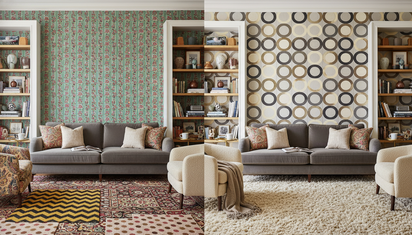
The most common mistake in high-end interiors isn’t a lack of pattern; it’s a lack of hierarchy. When your wallpaper, curtains, and rug all shout at the same volume, the room feels restless. In the 2026 design landscape, we are seeing a definitive shift toward “dynamic scaling,” a method where three distinct patterns coexist by occupying different visual “frequencies.”
To master this, follow the designer’s golden ratio of scale: Large, Medium, and Small. If you’ve committed to a sweeping, oversized botanical wallpaper—perhaps a mural-style installation with high Light Reflectance Values (LRV) to keep the room airy—your curtains should retreat into a medium-scale geometric or a subtle pinstripe. The rug then serves as the “small” scale, perhaps a micro-loop pile or a tonal Moroccan lattice from thebohorugs.com that provides texture without competing for the spotlight.
“Pattern is the language of a room, but scale is its grammar,” notes Julian Thorne, a leading Textile Historian. “By 2026, we’re moving away from the chaotic maximalism of the early 2020s. We’re seeing a return to Ghiordes-knotted precision where the rug acts as a steadying bass note to the more melodic, lyrical patterns on the walls.”
The Anchor Principle: Rugs as the Visual Foundation
When you are working with patterned wallpaper and curtains, the rug must act as the “gravity” of the room. A common design hurdle is choosing a rug that is too busy, causing the furniture to “float” aimlessly. In 2026, the trend is toward Organic-Modernist geometries—patterns that feel hand-drawn rather than digitally perfected. These rugs use variations in pile height rather than color contrast to create a pattern, allowing them to harmonize with bold window treatments.
- The Large-Scale Wall: Pair with a low-contrast, textured rug. Think distressed wool-silk blends that catch the light differently but maintain a singular hue.
- The Busy Window: If your curtains feature a dense floral or ikat, choose a rug with a wide-open border or a simple “broken” stripe to give the eye a place to rest.
- The Subtle Wall: If you’ve opted for a grasscloth or a faint plaster-effect wallpaper, this is your opportunity to let the rug lead. A bold, high-contrast tribal piece becomes the hero, while the curtains should remain a soft, solid linen.
The secret to 2026 styling is ensuring that no two patterns share the same “movement.” If your wallpaper has verticality (like a climbing vine), your rug should offer grounding horizontals or soft, circular motifs to break the tension.
Professional stagers use the “Squint Test” to verify if a room is balanced. Stand at the doorway and squint your eyes until the room becomes a blur. If one area—be it the rug, the walls, or the curtains—stands out as a dark or busy “blob” while the rest disappears, your scaling is off. The goal is a soft, even distribution of visual weight across the horizontal and vertical planes.
Mastering Texture as a Pattern Substitute
Sometimes, the “Pattern Paradox” is best solved by replacing one of the patterns with a high-definition texture. We are seeing an influx of Bio-Acetate fibers and recycled agave silks in the 2026 collections at thebohorugs.com. These materials create a “shimmer pattern” that reacts to the sun’s position throughout the day.
This approach is particularly effective in smaller rooms where three distinct prints might feel claustrophobic. By using a rug with a high-low carving technique, you achieve the visual interest of a pattern without the color fatigue. This allows you to go bolder with your window treatments—perhaps a heavy velvet with a foil-print overlay—while the rug provides a sophisticated, tactile counterpoint that feels expensive and intentional rather than cluttered.
Consider the interplay of light on these surfaces. A matte wallpaper absorbs light, while a luster-wash rug reflects it. Balancing these finishes is just as vital as balancing the patterns themselves. When you coordinate the sheen levels alongside the scale, the room moves from “decorated” to “architecturally curated.”
Texture as the Silent Mediator
“Texture is the punctuation of a room. Without it, your design is just one long, run-on sentence. By mixing a rugged, hand-knotted base with a refined, smooth wall finish, you create a dialogue between the surfaces that feels both intentional and timeless.”
— Julian Thorne, Senior Textile Historian
The Rule of Three Textures
To master this mediation, follow the Rule of Three:- The Smooth: Your wallpaper or painted wall (matte, eggshell, or silk-finish).
- The Soft: Your window treatments (linen, velvet, or sheer organza).
- The Structural: Your rug (jute, high-twist wool, or a carved “relief” pile).
Before committing to a Rug + Wallpaper pairing, place your samples together under a single light source. If the shadows cast by the rug’s pile are the same “weight” as the shadows in the wallpaper’s pattern, the room will feel balanced. If the rug is too flat, it will disappear; if it’s too shaggy, it will swallow the wall’s detail. Aim for a contrast in shadow depth to ensure each element retains its own identity.
8 Real-World Room Mastery Examples
1. The “Quiet Luxury” Living Room: Tone-on-Tone Depth
In a recent West London renovation, the challenge was a north-facing living room with low natural light. The designer opted for a subtle geometric wallpaper in a pale oyster hue and paired it with unlined linen curtains in a slightly darker oatmeal. The secret to preventing this from feeling “flat” was the rug choice. Instead of a busy pattern, they selected a tonal warm beige rug with a high-low pile height. Because the rug shared the same warm undertones as the wallpaper, it didn’t fight for attention. Instead, the varying textures of the wool created shadows that added architectural depth to the floor. Expert Insight: When working with a neutral palette, aim for at least three different textures. If the walls are smooth and the curtains are linen, the rug needs a tactile, hand-knotted soul to ground the room.2. The Maximalist Dining Room: Grounding Bold Florals
In 2026, we’re seeing a resurgence of “Grandmillennial” styles, but with a sharper edge. Imagine a dining room wrapped in bold, oversized botanical wallpaper featuring deep forest greens and hints of blush. Pairing this with heavy velvet curtains in a matching emerald creates a cocoon-like effect. To make this liveable, the rug must act as a “visual anchor.” A solid terracotta rug in a flatweave or short-pile wool provides a “rest for the eyes.” By pulling the secondary “earth” tone from the wallpaper (the terracotta) and using it as a solid block on the floor, the floral patterns on the wall feel intentional rather than chaotic.3. The Sage Sanctuary: Monochromatic Bedroom Harmony
Sage green remains a powerhouse color for 2026 due to its high Light Reflectance Value (LRV), which keeps rooms feeling airy yet grounded. In a Sydney-based primary suite, painted sage walls were paired with sheer white cotton curtains to maximize the morning sun. The “harmony bridge” here was a textured bouclé rug from thebohorugs.com in a soft moss shade. Because the rug was three shades darker than the walls but within the same color family, it created a seamless transition from the vertical to the horizontal plane. It felt like walking into a clearing in a forest—perfectly serene.4. The Airy Kitchen Nook: Elevating Utility
Kitchens and breakfast nooks are often dominated by hard surfaces like subtle white subway tiles or pale cabinetry. To soften the “clatter” of these spaces, designers are opting for light-filtering café curtains in a ticking stripe. The rug solution for 2026 is the elevated jute flatweave. Look for rugs that incorporate bio-acetate fibers or recycled silks woven into the jute. This adds a subtle shimmer that reflects the light coming through the curtains, making the floor feel as luminous as the tiled walls.5. The Moody Library: Balencing Dark Pigments
Dark, “dark academia” aesthetics require careful balancing so the room doesn’t feel like a cave. One homeowner used a charcoal grasscloth wallpaper and navy floor-to-ceiling drapes. The space risked feeling oppressive until they introduced a creamy, light-neutral Moroccan-style rug. The high contrast between the dark walls and the light rug creates a “sandwich” effect—dark on top, dark on the sides, light in the middle—which draws the eye inward and makes the seating area feel like a safe harbor.“The floor is the fifth wall. If your wallpaper is a poem, your rug should be the rhythm that makes it readable. You never want them reciting the same line at the same time.”
— Julian Thorne, Textile Historian
6. The Family Room: Mixing Patterns with Precision
Can you have patterned wallpaper and a patterned rug? Yes, if you master the scale. In a busy family home, a small-scale blue pinstripe wallpaper was paired with floral patterned curtains. The rug choice was a performance-grade Persian-style rug with a large-scale, faded motif. Because the wallpaper pattern was tiny and the rug pattern was large, they didn’t compete. The rug also featured a “denim blue” in its border that matched the wall stripes perfectly, tying the two disparate patterns together through color.7. The Urban Minimalist Flat: The Rug as a Hero
In many modern apartments, the walls are a standard gallery white and window treatments are discreet roller shades. This is the perfect “blank canvas” for a statement rug. For 2026, look for rugs with asymmetrical designs or hand-carved textures. When the walls and curtains are silent, the rug should “shout.” A bold, architectural rug from the curated collections at thebohorugs.com can turn a sterile white box into a high-design gallery space instantly.8. The Transitional Entryway: Textural Layering
First impressions matter. For a transitional entryway, a textured hemp-fiber wallpaper provides a tactile backdrop that handles “wear and tear” beautifully. Simple sheer linen panels on a sidelight window keep the space bright. The final touch in this 2026 look is layered rugs. A large, durable sisal rug provides the base, while a vintage-inspired wool runner with deep rust and navy tones is layered on top. The runner pulls the organic texture from the wallpaper but adds a “splash” of color that guides guests into the home.The Fatal Flaws of Accidental Design
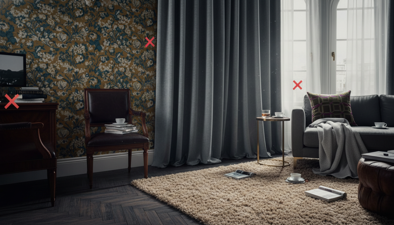
The “Silo” Shopping Trap
The most common mistake homeowners make is selecting their rug, wallpaper, and curtains at different stages of a renovation without a master swatch board. When you choose a rug in a vacuum, you’re looking at it as a piece of art on the floor. However, in the context of 2026’s shift toward maximalist layering and bio-acetate fiber blends, that rug must act as either the anchor or the echo for your vertical surfaces. If your wallpaper features a high-chroma botanical print and your curtains are a heavy, saturated linen, a rug with a competing high-contrast pattern creates visual friction. The eye doesn’t know where to rest, leading to a physical sensation of clutter even if the room is tidy.The Silent Killer: Undertone Discordance
Perhaps the most “fatal” flaw is ignoring the Light Reflectance Value (LRV) and the hidden undertones of your textiles. A “cool” grey wallpaper with blue undertones will instantly make a “warm” beige wool rug look dirty or aged. Designers often see this in 2026’s popular “Earth-Core” palettes. If your curtains are a sun-drenched terracotta but your rug has a subtle pink or cool mauve base, the room will feel “off” in a way that’s difficult to name but impossible to ignore. “The secret to the 2026 aesthetic is what I call ‘The Rule of Two and One’,” says **Julian Thorne, Lead Textile Consultant at The London Atelier**. “You can have two elements—say the wallpaper and the rug—share a dominant texture or color, but the third must provide the relief. When all three try to lead the orchestra, you don’t have a design; you have noise.”Scaling Errors and Visual Weight
We often see rooms where the scale of the wallpaper print is identical to the scale of the rug pattern. This creates a dizzying “shimmer” effect that shrinks the room’s perceived dimensions. To achieve a high-end, curated look, you must vary the scale. If your walls are adorned with a delicate, small-scale toile, your floor demands a rug with expansive, oversized motifs or a rich, solid texture to ground the space. When searching for pieces that bridge this gap, many designers are turning to the curated collections at thebohorugs.com. Their artisanal pieces often utilize hand-spun New Zealand wool and natural vegetable dyes, which offer the organic tonal variations necessary to soften the transition between a bold wall treatment and a structured window dressing.Never commit to a rug based on a digital screen. Always layer your wallpaper sample and curtain fabric directly on top of the rug sample. View them at 8:00 AM, 1:00 PM, and 8:00 PM under artificial light. In 2026, we are seeing a move toward metameric-conscious sourcing—ensuring that the green in your curtains doesn’t turn “muddy” when paired with the specific sheen of a silk-blend rug under LED lighting.
Texture Anarchy
A final pitfall is the failure to balance tactile weight. If you have heavy, embossed wallpaper and thick, floor-to-ceiling blackout drapes, a flat, thin rug can look cheap and unsubstantial. Conversely, a high-pile shag rug paired with delicate sheer curtains and smooth painted walls can feel bottom-heavy. The 2026 trend for tactile minimalism suggests that if your walls and windows are smooth, your rug should provide the “bite”—think high-low carvings or chunky jute weaves that provide a physical counterpoint to the sleekness of the room.Elevate Your Space
Discover the artistry of handmade luxury. Each rug is a masterpiece of tradition and modern design.
Expert Q&A
Should my rug be darker or lighter than my wallpaper?
In 2026, designers prefer rugs that are at least two shades darker than the walls to ‘ground’ the room. However, if you have dark, moody wallpaper, a lighter rug can provide necessary contrast to prevent the space from feeling like a cave.
How do I coordinate a patterned rug with patterned curtains?
The key is varying the scale. If your curtains have a small, busy print, your rug should have a large-scale, open pattern. They must also share at least one core color to maintain a sense of unity.
Does the Rug + Wallpaper combination have to match the curtains exactly?
No. Exact matching often looks dated. Instead, aim for ‘tonal harmony’ where the colors belong to the same family but vary in saturation and texture.
What rug works best with bold botanical wallpaper?
A solid-colored rug in a neutral earth tone or a highly textured jute/sisal rug works best. It allows the wallpaper to remain the ‘Hero’ without creating visual competition.
Can I use a floral rug with striped wallpaper?
Yes, this is a classic ‘maximalist’ pairing. Ensure the stripes are clean and architectural to balance the organic, fluid shapes of the floral rug.
What is the 60-30-10 rule in room coordination?
It is a color deco rule: 60% of the room (walls) should be a dominant color, 30% (rug and upholstery) a secondary color, and 10% (curtains or accents) an accent color.
How do I handle window treatments if my rug is very colorful?
Keep the curtains neutral and pull one of the subtle secondary colors from the rug for the curtain tie-backs or a slim border trim on the drapes.
Is it okay to mix different wood tones with rugs and wallpaper?
Absolutely. Use the rug as a bridge between your floor’s wood tone and the wallpaper’s color palette to create a seamless transition.
Should I choose the rug or the wallpaper first?
Always choose the element you love most first. It is generally easier to find a rug that matches wallpaper than it is to find wallpaper that perfectly complements a very specific, unique rug.
How does lighting affect my Rug + Wallpaper choice?
North-facing rooms have cool light, which can make grey rugs look blue. Always test your swatches at different times of the day to ensure the harmony holds up under artificial and natural light.
Written by TheBohoRugs Interior Design Team
Experts in handmade rugs, boho interiors, and modern home decor.
