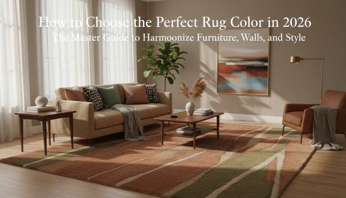
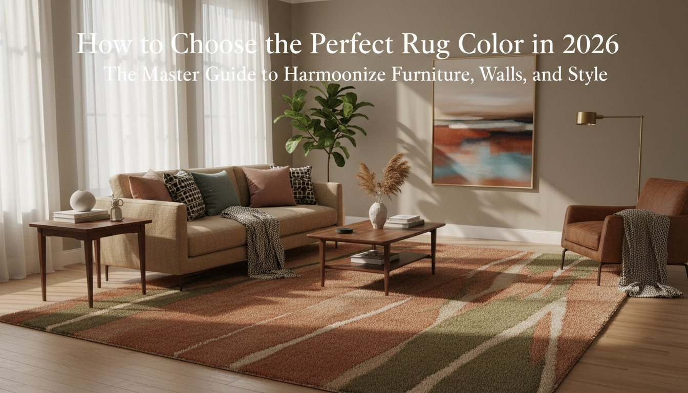
Forget the outdated rulebook that suggests your rug must be a carbon copy of your throw pillows. In 2026, design is shifting away from the sterile ‘gray-on-gray’ era toward a period of ‘Chromatic Vitality’ and ‘Tonal Depth.’ Your rug is the fifth wall of your room; it is the visual anchor that either unites a space or makes it feel like a collection of disjointed furniture. The choice between matching and contrasting is no longer a coin flip—it is a strategic decision based on the psychological mood you wish to curate and the architectural nuances of your home. Whether you are grounding a bold velvet sofa or seeking to expand a sun-drenched studio, mastering the interplay of undertones and saturation is the hallmark of a world-class interior.
“To choose the perfect rug color in 2026, identify the dominant undertone of your flooring and largest furniture pieces (warm vs. cool). For a harmonious, serene look, select a rug within two shades of your wall color (matching). For a dynamic, high-energy space, choose a rug in a complementary color—one opposite your furniture on the color wheel (contrasting). In 2026, the trend favors ‘Earthy Saturated Neutrals’ like terracotta, sage, and mushroom, which offer contrast through texture rather than just pigment.”
The Roadmap
Table of Contents
- The 2026 Rug Color Philosophy: Why it Matters Now
- Identify Your Base: The Physics of Undertones
- Match vs. Contrast: Choosing Your Room’s Narrative
- The 8-Step Designer Process for Color Selection
- 8 Real-Room Examples: From Gray Sofas to Teak Wood
- Material Science: How Fiber Affects Color Perception
- The 2026 Cheat Sheet: Quick Pairing Guide
- Avoid the Ghost Room: Common Color Mistakes
The Physics of Undertones: Decoding Furniture and Walls
The Hidden Temperature of Your Home
Ever wonder why a rug that looked like a perfect “warm sand” in the showroom suddenly feels like “dirty dishwater” in your living room? The culprit isn’t the rug—it’s the physics of undertones. Every material in your room, from the hand-carved teak of a mid-century sideboard to the Light Reflectance Value (LRV) of your eggshell walls, carries a secondary color that either sings in harmony or creates a jarring visual discord with your flooring.
In the design world of 2026, we’ve moved past simple color matching. We are now looking at the molecular level of how light interacts with fibers. For instance, the Bio-Acetate fibers increasingly popular in high-end rug production have a unique refractive index; they don’t just sit on the floor, they catch the ambient wall color and “throw” it back. If your walls have a hidden green undertone (common in popular 2026 shades like ‘Muted Moss’ or ‘Dusty Sage’), a rug with even a hint of red or pink in its base will look muddy. Instead, you’d want to browse the curated vegetable-dyed collections at thebohorugs.com, where the pigments are layered to maintain clarity regardless of the wall’s LRV.
The LRV Equation: Why Walls Dictate the Rug’s Weight
Light Reflectance Value, or LRV, measures the percentage of light a color reflects. A high LRV (whites and pale creams) will bounce light onto your rug, washing out subtle patterns. A low LRV (charcoals, deep navies, or the 2026 trend of ‘Oxblood Red’) will absorb light, making the rug colors appear deeper and more saturated than they actually are.
When you’re selecting a piece, consider the “shadow play” of your furniture. A heavy, dark walnut dining table creates a pool of shadow that can swallow a dark rug whole. To counteract this, designers are opting for rugs with a high-low pile or hand-knotted techniques from the Atlas Mountains. These rugs use variations in wool height to create “mechanical” highlights—areas where the wool catches light even in the shadows of a sofa, preventing the room from feeling bottom-heavy or claustrophobic.
“The biggest mistake I see isn’t choosing the wrong color, but ignoring the ‘ghost’ color. A gray sofa isn’t just gray; it’s either a blue-gray, a yellow-gray, or a purple-gray. If your rug doesn’t share that DNA, the room will always feel unsettled, no matter how expensive the furniture is.”
— Elena Vance, Senior Textile Archivist and Lead Designer
Woods and Weaves: The Grounding Elements
Your flooring and furniture legs act as the frame for your rug. In 2026, we’re seeing a massive shift away from the “gray-wash” wood floors of the 2010s toward honey-toned oaks and rich, oily walnuts. This return to warmth requires a specific approach to undertones:
- Warm Wood (Oak, Cherry, Teak): These woods have yellow or orange undertones. To create a sophisticated balance, look for rugs with cool-leaning neutrals like slate or olive to provide contrast, or lean into the warmth with terracotta and ochre for a “sun-drenched” Mediterranean feel.
- Cool Wood (Walnut, Ebony, Painted Black): These require rugs with a silver or blue base to feel cohesive. However, if you want to avoid a “cold” room, a cream rug with a high-luster silk or Bio-Acetate sheen can add necessary warmth without clashing with the wood’s cool DNA.
- The Metal Variable: Don’t forget your accents. The brushed brass popular in modern lighting acts as a “warm” element, while chrome or blackened steel acts as a “cool” anchor. Your rug should bridge the gap between these metallic temperatures.
If you’re struggling to identify the undertone of your sofa or wall, hold a piece of pure white printer paper against it in natural midday light. The paper acts as a neutral baseline. Suddenly, that “beige” sofa will clearly reveal its true identity: does it look slightly pink, yellow, or green against the white? Use that discovery to filter your search on thebohorugs.com—if the sofa is pink-beige, look for rugs with warm, earthy pigments to lean into the glow.
The goal is to find a rug that acts as a “translator” between your walls and your furniture. By understanding the physics of how these surfaces talk to one another, you stop guessing and start designing with the precision of a professional. When the undertones align, the furniture doesn’t just sit on the rug—it belongs there.
Match vs. Contrast: Creating Emotional Resonance
The Sophistication of Tonal Layering (The Match)
When we speak of “matching” in a luxury context, we aren’t talking about finding a rug that is the exact shade of your velvet sofa. That approach often leads to a “flat” room—a visual dead end where the eye has nowhere to rest. Instead, 2026 is defined by **tonal layering**. This involves selecting a rug that shares the same base undertone as your walls or primary furniture but exists two or three shades apart on the saturation scale. If you have a sofa in a rich, “Oatmeal” linen, look for a rug with a slightly higher **Light Reflectance Value (LRV)** in a warm cream, or perhaps a deeper “Toasted Almond” with a high-pile texture. This creates a sense of sanctuary and cohesion. At thebohorugs.com, we’ve seen a surge in interest for hand-spun wools that incorporate subtle, undyed organic variations. These “natural matches” provide the serenity of a monochromatic palette without the sterile feeling of a showroom.The Power of the Counterpoint (The Contrast)
Contrast is where the personality of the homeowner truly shines. It’s a bold declaration of intent. In 2026, we are seeing a pivot toward **Complementary Contrast**—using colors from opposite sides of the wheel to create a “vibration” that feels energetic yet balanced. Imagine a room with deep, “Espresso” stained walnut furniture and walls painted in a moody, low-LRV “Forest Floor” green. A matching dark rug would swallow the light. However, introducing a rug in a **dusty terracotta or a sun-baked clay**—colors reminiscent of traditional pigments found in the Atlas Mountains—instantly lifts the room. This contrast doesn’t just “pop”; it provides an emotional warmth that makes the dark furniture feel grounded rather than heavy.- Focus on Undertones: A “cool” gray sofa paired with a “warm” beige rug can often look like an accident. Always ensure your contrast shares a common temperature.
- Material Matters: High-contrast looks benefit from matte finishes. The 2026 shift toward Bio-Acetate fibers blended with silk allows for high-contrast colors that retain a sophisticated, low-sheen elegance.
- The 70/30 Rule: If your furniture and walls are neutral (70%), let the rug be the 30% that introduces a saturated, earthy pigment like “Copper Sulfide” blue or “Raw Sienna.”
“The most successful rooms aren’t those where everything belongs to the same family, but where every piece is having a conversation. A rug should either be the supportive listener that lets the furniture speak or the eloquent orator that commands the floor. The moment you achieve that balance, the room begins to breathe.”
— Julian Thorne, Senior Textile Historian & Design Consultant
Before committing to a high-contrast rug, observe the shadows in your room at 4:00 PM. If your room has northern exposure (cooler, bluer light), a high-contrast warm-toned rug from the collections at thebohorugs.com will help counteract the “chill” of the natural light, making the contrast feel intentional and cozy rather than jarring.
The 8-Step Designer Framework for Selection
The Art of the Ground-Up Design: A 2026 Framework
Choosing a rug color isn’t merely a shopping trip; it’s an exercise in visual architecture. As we look toward the design landscape of 2026, the industry is shifting away from the clinical “safe” grays of the last decade toward a more emotive, grounded palette. Designers are no longer asking what “matches,” but rather what resonates. To master this, we follow a rigorous eight-step process that ensures your floor covering acts as a sophisticated anchor rather than a secondary thought.
1. Identify the Dominant Visual Anchor
Before looking at swatches, catalog the heavy hitters in your room. Your sofa, bed frame, or dining table holds the most “visual weight.” In 2026, we are seeing a massive resurgence in warm wood species like honeyed oak and American walnut. If your furniture has a strong yellow or red undertone, your rug needs to acknowledge it. A cool-toned, blue-gray rug against a warm walnut table can feel jarring and “off,” whereas an earthy terracotta or a muted sage creates an immediate sense of belonging. Look at the grain; if the furniture is matte and organic, the rug should reflect that same tactile honesty.
2. Decode Your Wall’s Light Reflectance Value (LRV)
Wall color is the “envelope” of your room. Professional designers look specifically at the Light Reflectance Value (LRV)—a scale from 0 to 100 that measures how much light a color reflects. If your walls are a deep, moody charcoal (low LRV), a cream or ivory rug from thebohorugs.com will provide the necessary “lift” to prevent the room from feeling like a cave. Conversely, if you’re working with high-LRV “Gallery White” walls, a saturated, mid-tone rug provides the gravity needed to keep the furniture from appearing as if it’s floating in a void.
3. Embrace the Rule of Intentional Dissonance
The biggest mistake in home styling is attempting to find a rug that is the exact same shade as the sofa. This leads to a “flat” room where nothing stands out. Instead, we aim for intentional dissonance—choosing a color that is two shades darker or lighter than your upholstery, or moving to a complementary side of the color wheel. If you have a navy velvet sofa, don’t buy a navy rug. Try a dusty ochre or a soft, weathered copper. This creates a layered, curated look that feels like it evolved over time rather than being bought as a “set.”
“The most successful rooms in 2026 will treat the rug as a chromatic bridge. It’s the connective tissue that translates the verticality of the walls into the horizontal comfort of the furniture.”
— Julian Thorne, Senior Textile Historian
4. Deploy the 2026 Color Wheel Strategy
While classic color theory remains, the 2026 trend is leaning heavily into analogous schemes with a twist. This involves picking three colors that sit next to each other on the wheel—for example, moss green, soft olive, and muted mustard. When choosing your rug color, look for one that incorporates at least one “thread” of your wall color but introduces two new, harmonious tones. This creates a sophisticated, tonal depth that feels modern yet timelessly elegant.
To achieve designer-level balance, allocate 60% of the room to your primary color (usually walls), 30% to your secondary color (the rug), and 10% to accents (pillows and art). In 2026, we recommend the “Rug-First” approach, where the 30% dictates the remaining palette.
5. Calibrate for Atmospheric Lighting
A rug color that looks perfect on a screen can transform entirely under 3000K LED lighting or northern afternoon sun. We are seeing a shift toward Bio-Acetate fibers and recycled silks that have a directional “nap.” This means the rug may look deep and saturated from one side of the room and shimmering and light from the other. Always view your potential rug color at “toe level” during the hour you use the room most. A deep burgundy might look regal at night but appear too heavy in a breakfast nook flooded with morning light.
6. Lean Into Earthy, Mineral Pigments
The “New Neutrals” of 2026 are far from boring. We are moving away from stark whites and toward mineral-based pigments: think oxidized copper, sun-baked clay, and raw umber. These colors are inherently forgiving and pair beautifully with the organic materials currently dominating luxury interiors. When browsing the artisanal collections at thebohorugs.com, look for rugs that use vegetable dyes. These dyes create a natural “abrash”—subtle color variations that give the rug life and prevent it from looking like a mass-produced synthetic piece.
7. Balance Visual Weight with Texture
Color doesn’t exist in a vacuum; it’s married to texture. A “solid” color rug can still have immense character if it utilizes different pile heights or weaving techniques. Hand-knotted techniques from the Atlas Mountains, for instance, often use undyed wools that provide a spectrum of creams, beiges, and browns in a single piece. If your room is full of sleek, hard surfaces (marble tables, glass lamps), a high-texture, “shaggy” rug in a neutral tone will provide the necessary visual warmth that a flat-weave cannot, regardless of the color.
8. The Physical “Swatch and Shadow” Test
The final step is the most practical. Before committing to a full-size investment, use a mood board or a sample swatch. Place it directly against your floorboard and up against your sofa fabric. Watch how the shadow falls on it. A rug color should never disappear, but it shouldn’t “scream” either. It should feel like the natural foundation upon which the rest of your life is built. If the swatch makes your wall color look “muddy,” move a step cooler; if it makes the room feel “sterile,” move toward a warmer, sun-drenched pigment.
Always consider the “break” between the rug and your flooring. If you have dark ebony floors, a dark navy rug will get lost. Aim for at least three degrees of separation in value to ensure the rug’s silhouette—and the craftsmanship of its edges—is clearly visible.
8 Real-Room Case Studies: 2026 Color Pairings in Action
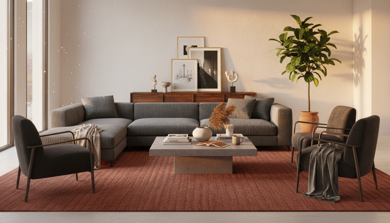
1. The Charcoal Velvet Sofa + Alabaster Walls
In this high-contrast living room, the goal was to prevent the space from feeling “cold” or overly clinical. The walls feature a crisp white with a high Light Reflectance Value (LRV) of 82, which can sometimes make dark furniture look like a black hole in the center of the room.
The solution was a deep terracotta and burnt orange Oushak rug from thebohorugs.com. By introducing an earthy, saturated pigment on the floor, we bridged the gap between the dark sofa and the bright walls. The warmth of the rug’s vegetable dyes pulls the red undertones out of the charcoal velvet, making the seating area feel intentional rather than isolated.
“The 2026 palette is heavily influenced by ‘geological warmth.’ We’re seeing a massive shift toward rugs that look like they were dyed with crushed minerals and clay, which provides a necessary soul to modern, high-contrast rooms.”
— Julian Thorne, Textile Historian
2. Mid-Century Walnut + Sage Green Walls
Natural wood tones like walnut carry significant visual weight and rich, red-brown undertones. When paired with the “it” color of 2026—Muted Sage (specifically those with a gray-blue base)—the room can easily become too dark.
To balance this, we opted for a distressed cream rug with subtle charcoal striations. The light base of the rug keeps the walnut legs from disappearing into the floor, while the cool charcoal accents in the rug’s pattern speak to the sage walls. This creates a “nature-inspired” sandwich: earth (wood), foliage (walls), and clouds (rug).
For 2026, look for rugs incorporating Bio-Acetate fibers or silk-blends. These materials have a unique way of catching low-angle light, which is essential for rooms with darker wall colors like Sage or Forest Green. It ensures the floor glows even when the sun isn’t directly hitting it.
3. The “New Neutral” Greige Sofa + Warm White Walls
This is perhaps the most common configuration, but also the easiest to get wrong. When everything is “greige,” the room loses its pulse. To fix this, we avoided another neutral rug and instead chose an Olive Green hand-knotted piece.
Olive acts as a “neutral-plus” in 2026. It has enough brown in its DNA to match the sofa’s warmth, but enough pigment to provide a focal point. Using a rug from thebohorugs.com’s artisanal collection adds texture that breaks up the flat planes of the furniture and walls.
4. Cognac Leather + Terracotta Walls
This room is a masterclass in analogous color schemes. The leather and walls occupy the same side of the color wheel. To prevent the room from looking like a monochrome desert, we introduced a Slate Blue rug.
Blue is the direct complement to orange/brown. By placing a cool-toned rug under the warm leather, the cognac color actually appears richer and more expensive. This is a classic designer trick: to make a color “pop,” surround it with its opposite.
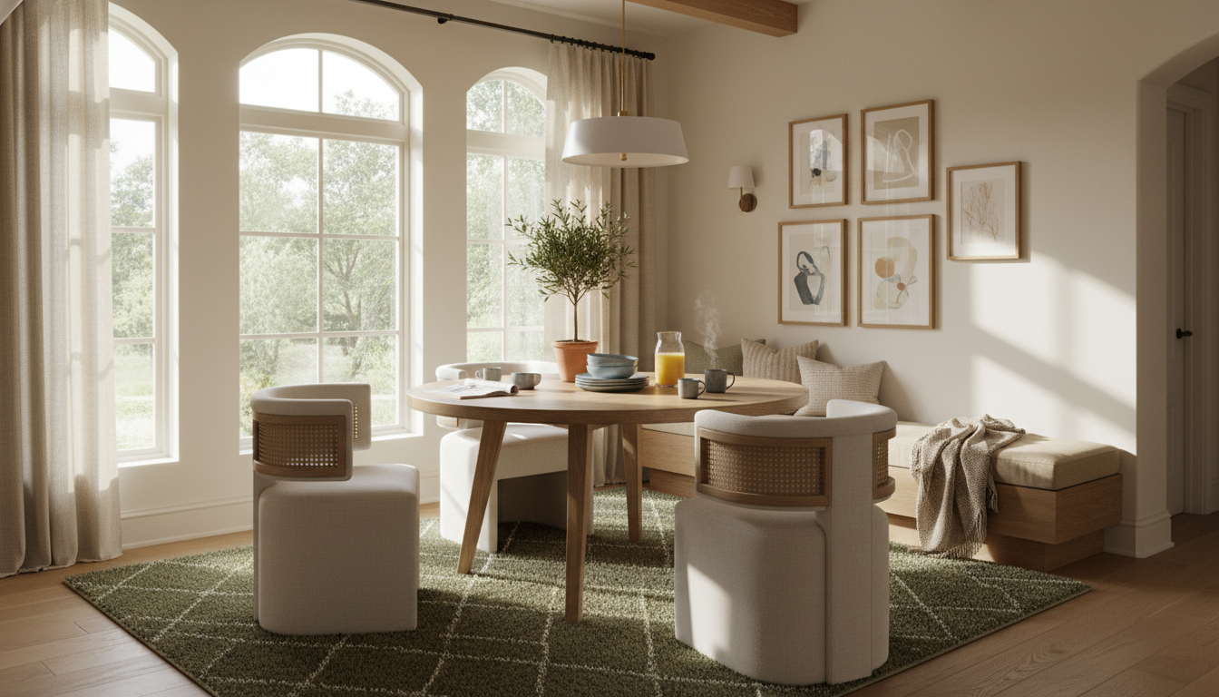
5. Navy Blue Cabinetry + Light Oak Floors
In a kitchen or open-plan dining space with navy elements, a dark rug would make the space feel heavy. We selected a flat-weave kilim in soft sand and apricot tones. The apricot serves as a subtle counter-balance to the navy, while the sandy base mimics the light oak floors, extending the visual floor space and making the room feel twice as large.
- Wall Tone: Bone White (Warm undertones)
- Furniture: Navy Blue
- Rug Choice: Warm Sand with geometric apricot accents
- Result: An airy, coastal-modern vibe that avoids “nautical” clichés.
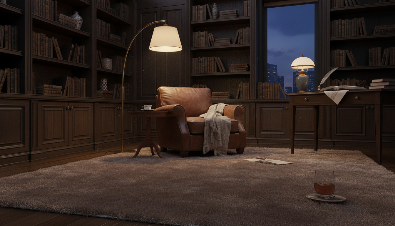
6. The Maximalist Jewel-Tone Suite
When you have an Emerald Green sofa and Plum-colored walls, the rug must act as the “diplomat.” A busy, colorful rug would create visual chaos. Instead, we utilized a monochromatic, high-texture rug in a deep “Mushroom” taupe.
The secret here is the hand-carved pile height. While the color is quiet, the varying heights of the wool create shadows that mimic a pattern. This provides the sophistication a maximalist room needs without competing for attention with the bold furniture.
7. Industrial Black Accents + Raw Brick Walls
Industrial spaces often suffer from “hard surface syndrome.” To soften the black steel and red brick, we steered away from traditional patterns and chose a thick, shaggy Moroccan Berber with an ivory base and simple black asymmetrical lines.
The organic, slightly “imperfect” lines of a hand-woven rug from the Atlas Mountains provide a human touch to a machine-age room. The creaminess of the wool also lightens the “weight” of the red brick walls, making the space feel residential rather than commercial.
If your furniture has dark legs (black or espresso), your rug color should be at least two shades lighter than the floor. If your furniture sits flat on the floor (like a plinth sofa), the rug color must provide a clear contrast to the upholstery fabric to avoid a “floating” furniture effect.
8. Small Apartment: Mixed Woods + Cool Gray Walls
In a space where you can’t change the “millennial gray” walls, the rug is your only tool for modernization. We moved away from the cool spectrum entirely and anchored the room with a Golden Ochre rug.
The yellow-gold tones in the rug cancel out the depressing qualities of the gray walls, reflecting warmth back up onto the mixed wood furniture (teak and pine). It transforms a “rental-grade” gray box into a sun-drenched sanctuary. By sourcing a rug with high-low wool construction, we also added the tactile depth that 2026 buyers crave.
When you browse the curated galleries at thebohorugs.com, look specifically at how the rugs interact with the leg finishes and wall shadows in the photography. These case studies prove that the “perfect” color isn’t a single choice—it’s a conversation between every surface in the room.
The Saturated Neutral: 2026’s Answer to the Gray Era
The Shift Toward Pigmented Depth
For the better part of a decade, “Cool Gray” was the industry’s safety net. It was the default setting for open-concept living, prized for its ability to disappear into the background. However, as we move into 2026, that clinical sterility has been replaced by what designers are calling Saturated Neutrals. These aren’t just colors; they are atmospheres. We are seeing a move away from the “greige” vacuum and toward hues that possess a distinct soul—colors like Mushroom, Faded Terracotta, and Dusky Olive. The magic of a saturated neutral lies in its Light Reflectance Value (LRV). While the flat grays of 2018 often had high LRVs that made rooms feel stark under LED lighting, 2026’s trending rug tones sit in the mid-range (LRV 35–55). This allows the rug to absorb harsh artificial light while reflecting a warm, sophisticated glow that makes furniture feel “anchored” rather than just placed.Why Your Room Needs an “Earthy Foundation”
In 2026, the rug is no longer a background player; it is the visual tectonic plate upon which your entire design rests. This shift is driven by a collective desire for tactile wellness. When you choose a rug in a saturated neutral—perhaps a deep sand or a weathered clay—you are introducing a sense of organic permanence. These colors play exceptionally well with the natural wood grains currently dominating furniture trends, such as rift-sawn oak and dark walnut. Instead of the jarring contrast of a cool gray rug against warm wood, a saturated neutral creates a tonal bridge. This is particularly evident in the artisanal pieces found at thebohorugs.com, where the focus on vegetable-dyed wools allows for a variegated, “living” color that shifts beautifully from morning light to evening shadows.“The 2026 palette isn’t about hiding the floor; it’s about giving it a pulse,” says Elena Vance, Senior Textile Historian. “We are seeing a massive return to unbleached wools and Bio-Acetate fibers that carry the DNA of the landscape. A rug today shouldn’t just match your sofa; it should feel like it grew out of the architecture of the house.”
Mastering the “Tone-on-Tone” Balance
To pull off this look without the room feeling muddy, you must embrace the 2026 rule of Textural Contrast. If your walls are a smooth, matte “Warm White,” your rug should provide the grit. Look for:- Hand-knotted techniques: These create subtle “abrash” (natural color variations) that prevent a solid-colored rug from looking like a carpet remnant.
- High-Low Pile: Using a single saturated neutral color but varying the height of the fibers to create pattern through shadow.
- Bio-Acetate Blends: A 2026 staple that adds a silk-like luster to earthy tones, giving a humble jute or wool rug a high-end, editorial finish.
When working with saturated neutrals, designers suggest a new ratio. Dedicate 60% of the room to your primary neutral (walls/large furniture), 30% to your rug’s saturated neutral (e.g., a deep Sage or Camel), and 10% to a “punch” color in your accessories. This ensures the rug acts as the bridge that prevents the room from feeling washed out.
Integrating with Existing Architecture
One of the most practical reasons for the death of flat gray is its inability to hide the “sins” of a lived-in home. Saturated neutrals are incredibly forgiving. A rug in a deep ochre or a complex basalt masks foot traffic and pet hair far better than a stark gray or cream. As you browse the curated selections at thebohorugs.com, look for pieces that utilize hand-spun New Zealand wool. The natural lanolin in these fibers works with the deeper 2026 pigments to create a rug that doesn’t just look expensive—it feels substantial. It’s a move toward “quiet luxury” where the color doesn’t shout for attention, but the quality of the pigment ensures the room feels complete.Tactile Color: How Texture Changes Your Palette
The Physics of Light: Why a Swatch Isn’t Always What It Seems
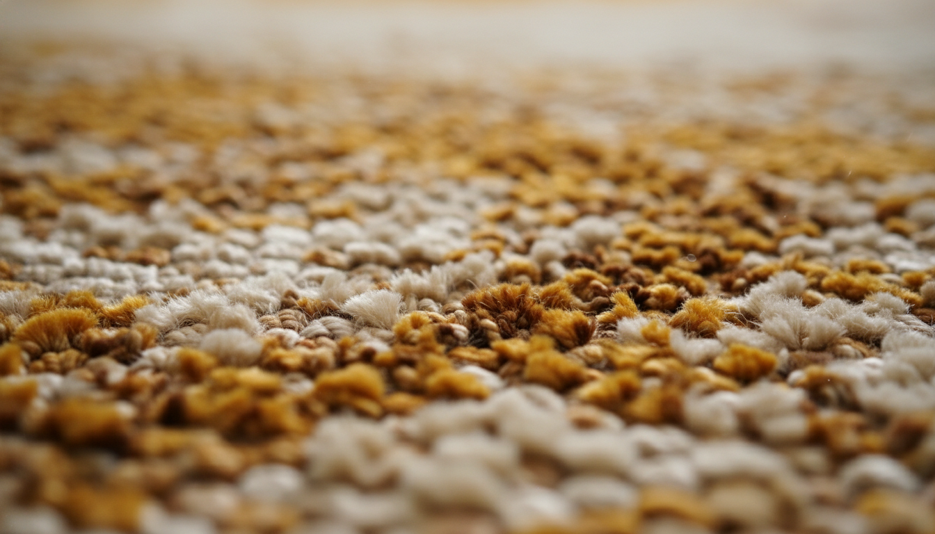
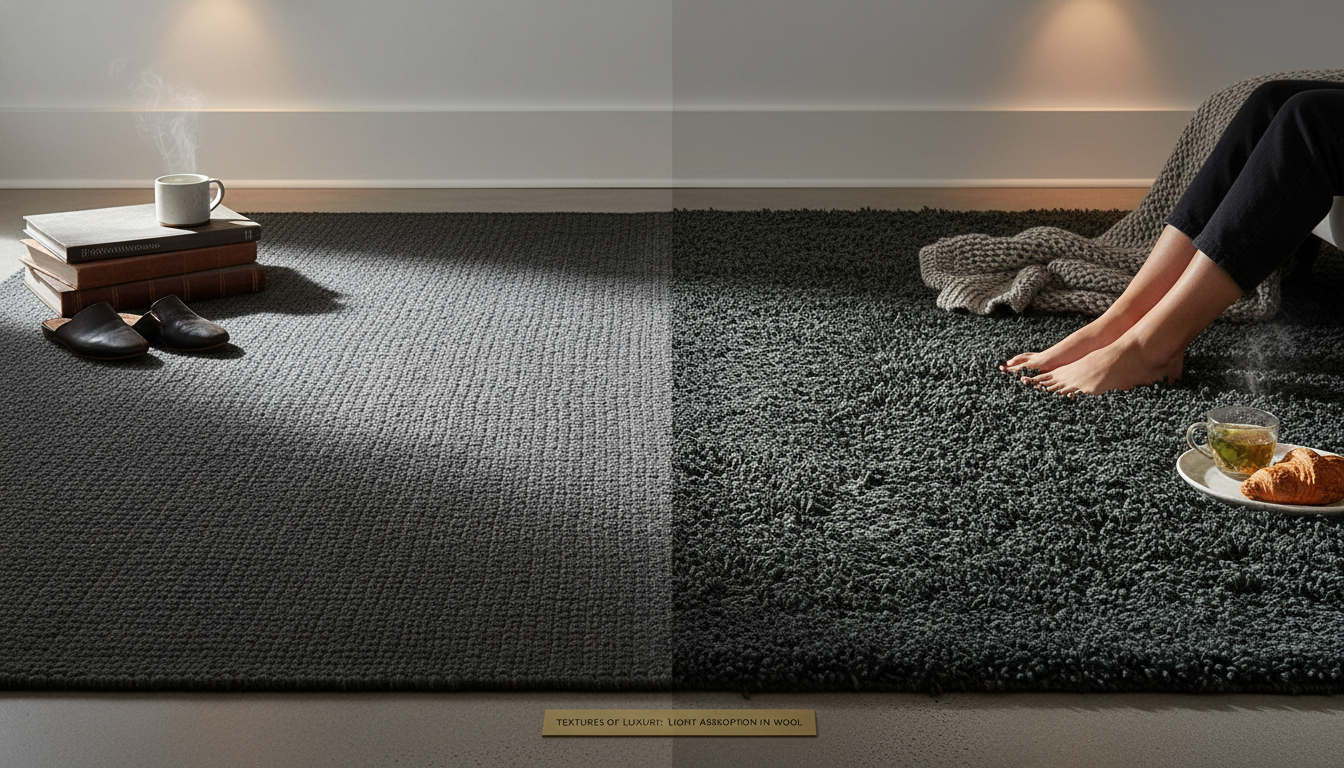
In the design world, we often talk about color as a fixed variable, but in reality, color is a shape-shifter. By 2026, the trend toward sensory-driven interiors means we are looking at rugs through the lens of “tactile color.” When you choose a rug for your living room, you aren’t just picking a pigment; you’re picking how that pigment interacts with the Light Reflectance Value (LRV) of your space. A flat-weave jute rug in a soft terracotta will absorb light, making the room feel grounded and earthy. However, that same terracotta rendered in a high-sheen bio-acetate or recycled silk will bounce light back into the room, making the color appear two shades lighter and infinitely more energetic.
This is where many homeowners trip up. They find the perfect match for their sofa in a small, flat sample, only to realize the full-size rug feels “off” once it’s laid out. To master the 2026 look, you must consider the pile height and fiber density. A deep, hand-tufted wool rug creates micro-shadows within the fibers, which naturally desaturates the color and adds a sense of “quiet luxury.” Conversely, a low-profile, tightly woven rug allows the color to remain crisp and punchy—perfect for those minimalist-maximalist spaces where precision is key.
Fibers That Redefine the Palette
The materials hitting the looms for 2026 are more sophisticated than ever. We’re seeing a massive resurgence in hand-carded Tibetan wool, which retains natural lanolin and gives colors an organic, slightly variegated appearance. This “abrash” effect—where the color naturally fluctuates—is exactly what prevents a room from looking like a showroom and makes it feel like a curated home.
- High-Sheen Botanicals: Fibers like Tencel and bamboo silk amplify color saturation. Use these when you want a rug to act as a jewel-box focal point against matte walls.
- Matte Naturals: Wool, mohair, and sisal soften bold colors. If you’re nervous about a deep navy or forest green, choosing it in a matte finish makes it feel like a neutral.
- Carved Dimensions: High-low piles create a “self-pattern” where the color remains the same, but the shadow lines of the carving create a secondary visual rhythm.
“We’ve moved into an era where ‘flat’ is the enemy of ‘fine’,” says Julianne De Luca, Lead Textile Historian. “The most successful 2026 interiors use texture to break up monochromatic planes. A rug shouldn’t just be a color; it should be a landscape. When you walk across a hand-knotted piece from thebohorugs.com, the shifting pile creates a gradient effect that a machine-made rug simply can’t replicate. It’s that movement of light that makes the color feel alive.”
If you are working with a room that lacks natural light, avoid high-pile, shaggy rugs in dark tones. The deep texture creates “micro-shadows” that can make a charcoal or deep olive rug look almost black and “heavy.” Instead, opt for a low-pile rug with a subtle sheen. This allows the rug to capture whatever light is available, lifting the color and ensuring your 2026 palette doesn’t disappear into the floorboards.
Matching Texture to Furniture Tones
The relationship between your rug’s texture and your furniture’s finish is the secret sauce of professional designers. If you have a slick, cognac leather sofa, a rug with significant “tooth”—like a chunky wool loop or a nubby jute—provides a necessary counterpoint. The friction between the smooth leather and the rugged floor covering creates visual interest through contrast, even if the colors are in the same tonal family.
On the other hand, if your furniture is upholstered in a heavy bouclé or velvet, a smoother, more refined rug surface like a fine-spun artisanal wool will prevent the room from feeling “over-upholstered.” It’s about balance. By choosing a rug from a curated source like thebohorugs.com, you can find those specific artisanal textures—from the ruggedness of the Atlas Mountains to the refined sheen of modern eco-fibers—that turn a simple color choice into a masterclass in 2026 design.
Elevate Your Space
Discover the artistry of handmade luxury. Each rug is a masterpiece of tradition and modern design.
Expert Q&A
Should my rug be lighter or darker than my sofa?
In 2026, designers recommend a contrast of at least two shades. If you have a dark charcoal sofa, a lighter rug in a warm taupe or cream will ground the piece without making the room feel heavy. Conversely, a light beige sofa pops beautifully against a deeper earthy tone like rust or olive.
What is the best rug color for a gray sofa in 2026?
Avoid cool grays. Instead, opt for ‘warm neutrals’ or ‘earthy pigments.’ A sage green, dusty terracotta, or a warm mushroom rug will breathe life into a gray sofa and prevent the space from feeling dated or clinical.
How do I match a rug to wood floors?
Focus on the undertone. If your floors are warm (red or orange tones like Cherry or Oak), look for rugs with warm accents. If you have cool, ash-toned floors, go for blues, greens, or crisp whites. To make the floor ‘pop,’ choose a rug that is significantly lighter or darker than the wood.
Can I use a patterned rug with patterned wallpaper?
Yes, provided you vary the scale. If your wallpaper has a large-scale floral print, choose a rug with a small-scale geometric pattern or a solid textured weave. The colors should share at least one common thread to maintain cohesion.
What rug colors make a small room look bigger?
Cool, light colors like soft blue, pale lavender, or light sand reflect more light and make walls feel more distant. Avoid dark, heavy borders on rugs in small spaces, as they visually ‘box in’ the floor.
Is it better to match the rug to the walls or the furniture?
Match the rug to the furniture for a ‘zoned’ look that defines a seating area. Match the rug to the walls to create an expansive, airy feel where the furniture appears to float within the space.
How do I choose a rug for a room with multiple wood tones?
Select a multi-colored or variegated rug that contains flecks of all the wood tones present in the room. This acts as a ‘bridge,’ making the disparate wood elements feel intentional rather than accidental.
Are bold colored rugs going out of style in 2026?
Quite the opposite. We are seeing a move toward ‘New Primary’ colors—deep ochre, navy, and burgundy—but used in a sophisticated, tonal way rather than neon brightness.
How does natural light affect my rug color choice?
North-facing rooms have cool, bluish light, which can make gray rugs look depressing; choose warm tones to compensate. South-facing rooms have intense light that can wash out pale colors, making it a great place for deeper, more saturated rugs.
Should the rug match the curtains?
They should complement, not match. If your curtains are a solid color, a patterned rug containing that color is a classic designer move. Avoid using the exact same fabric/pattern for both to prevent a ‘showroom’ look.
Written by TheBohoRugs Interior Design Team
Experts in handmade rugs, boho interiors, and modern home decor.