

The beige safety net has officially frayed. After a decade of ‘Greige’ dominance, the 2026 design landscape is undergoing a radical Pigment Renaissance. We are no longer decorating for resale value; we are decorating for emotional resonance. Saturated hues like deep plum, mossy green, and electric terracotta aren’t just accents anymore—they are the foundation of the room. However, the leap from a neutral palette to a high-octane color story can feel like a design risk. How do you introduce a vibrating ochre rug without turning your living space into a visual assault? This guide dismantles the fear of color, offering a sophisticated blueprint for using Bold Color Rugs 2026 to anchor your home with confidence, warmth, and curated balance.
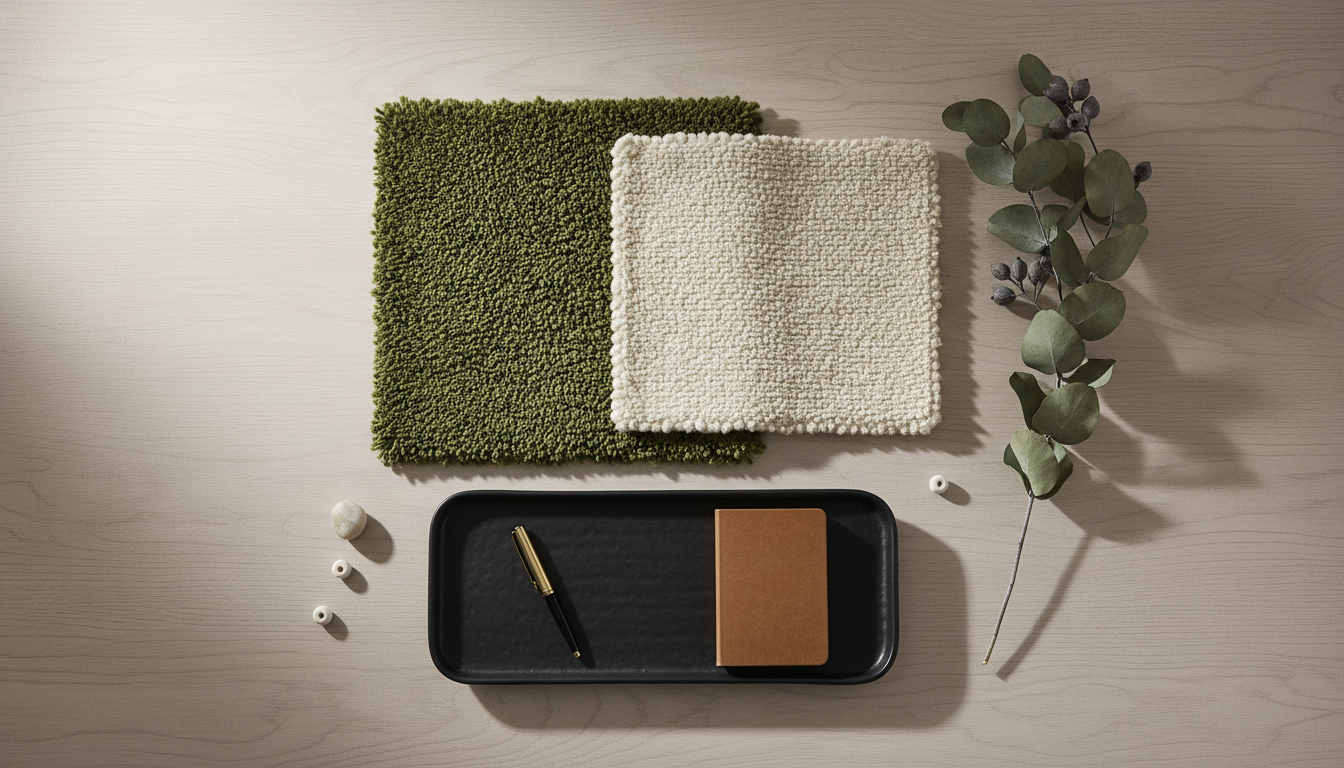
“To style Bold Color Rugs 2026 without overwhelming a room, follow the ‘Hero Anchor’ principle: select one saturated or earthy rug as the primary focal point and balance it with neutral-toned furniture and walls. Use texture—such as boucle, raw silk, or jute—to soften the visual impact. Ensure the rug is properly scaled so furniture legs ground the color, and repeat the rug’s primary hue in at least two smaller room accents (like art or throw pillows) to create a cohesive, designer-level flow.”
The Roadmap
Table of Contents
- The 2026 Shift: Why Saturated Pigments are Replacing Neutrals
- 7 Designer Rules for Balancing Bold Color Underfoot
- Rule 1: The Hero Hue Strategy
- Rule 2: Texture as a Tonal Buffer
- Rule 3: The Critical Nature of Scale
- Rule 4: Managing Light and Orientation
- Rule 5: Subtlety in Movement and Pattern
- Rule 6: The Art of Color Echoes
- Rule 7: The Layering Safety Net
- 8 Trending Room Looks to Copy for 2026
- Mistakes to Avoid: Why Some Bold Rugs Fail
- Maintenance for High-Pigment Fibers
The 2026 Pigment Renaissance: Beyond the Beige Horizon

If the early 2020s were defined by a clinical obsession with “greige” and the ubiquitous “sad beige” minimalism, 2026 is the year we finally break the fever. We are witnessing a seismic shift in interior psychology—what designers are calling the Pigment Renaissance. It is no longer about making a room look “clean”; it is about making it feel visceral, grounded, and intensely personal. This shift isn’t just about color for the sake of color; it’s about a return to saturated color rugs 2026 that act as the emotional heartbeat of a home.
The End of the “Safe” Neutral
For years, the rug was the silent partner in a room, designed to disappear underfoot. But as we move into 2026, the floor is reclaiming its status as the “fifth wall.” The trend reports from major design houses suggest that homeowners are experiencing “neutral fatigue.” We crave the warmth of a terracotta rug or the grounding depth of a mossy green. This isn’t a chaotic splash of neon; rather, it’s a sophisticated embrace of earthy tone rugs styling that brings the outdoors in with a refined, high-fashion edge.
The beauty of this new era lies in the complexity of the dyes. Modern textile engineering has allowed for a “luminous saturation”—where a rug can be deeply colorful without feeling heavy or dated. We’re seeing a rise in the use of Bio-Acetate fibers blended with high-twist New Zealand wool, which creates a subtle shimmer that changes as the sun moves across the room, preventing a bold rug from feeling like a flat block of color.
“In 2026, we are moving away from the ‘hospitality-look’ of cold grays. We want rooms that tell a story. A single, saturated-hue rug in a deep ochre or a charred plum provides a sense of history and permanence that a neutral rug simply can’t match. It’s about creating a sanctuary that feels curated, not just decorated.”
— Elena Vance, Lead Textile Historian & Design Consultant
Understanding Light Reflectance Value (LRV) in Rug Selection
When you’re learning how to style bold color rugs, the most important technical aspect to consider is the Light Reflectance Value (LRV). In the past, this was a term reserved for paint, but in 2026, top-tier designers are applying it to textiles. A deep, saturated color rug with a low LRV—like a midnight navy or a forest green—will absorb light, making a large, airy room feel more intimate and focused. Conversely, an earthy terracotta or mustard rug with a higher LRV can bounce warmth back into a north-facing room that otherwise feels chilly.
The goal is to find a balance where the rug provides main character energy without demanding all the oxygen in the room. This is achieved by looking at the rug’s “undertone temperature.” For example, the olive green rugs trending for 2026 often have a golden undertone, making them pair beautifully with natural wood grains and brass accents found in modern artisanal furniture.
To prevent a bold rug from overwhelming your space, stick to the classic designer ratio. Let your bold color rug 2026 be the 30% “secondary color” in your room. Pair it with 60% neutral tones (walls and large upholstery) and 10% high-contrast accents. This allows the rug to be the star while the rest of the room provides the visual “quiet” necessary for the eye to rest.
The New Earthy Palette: Beyond the Basics
The 2026 palette is a sophisticated departure from the primary colors of the past. Designers are leaning into statement color rugs that feel “found” rather than “made.” Think of colors you would see in a Mediterranean landscape at dusk:
- Burnt Cinnabar: A richer, more energetic version of rust that adds instant warmth to industrial spaces.
- Deep Sage & Moss: These are the new neutrals. An olive green rug acts as a bridge between indoor plants and indoor comfort.
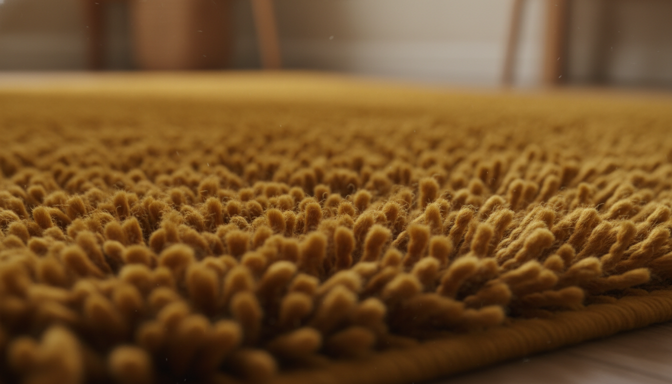
- Saturated Ochre: A yellow that has been “dirtied” with brown and gray to make it livable and sun-drenched.
- Midnight Plum: A daring alternative to navy that feels luxurious and unexpected underfoot.
As we move deeper into this decade, the choice to go bold isn’t just a trend; it’s an act of confidence. By choosing saturated color rugs 2026, you aren’t just covering a floor—you are setting the stage for a home that feels as rich and multifaceted as the lives lived within it.
Rule 1: Select Your Hero Hue with Intention
The Psychology of Deep Pigments
Choosing your hero color requires looking beyond a tiny swatch. In 2026, we’re seeing a massive resurgence in **vegetal-dyed wools** and high-twist yarns that hold color with incredible depth. A deep Terracotta or a “Smoked Paprika” rug provides a sense of grounding and history. If you are leaning toward the cooler end of the spectrum, look for a “Midnight Moss” or “Deep Plum.” These aren’t just colors; they are moods. The secret to making a saturated rug work is understanding its **Light Reflectance Value (LRV)**. A rug with a low LRV—meaning it absorbs light rather than bouncing it back—will make a large room feel intimate and curated. At thebohorugs.com, the focus for the upcoming season is on rugs that use traditional hand-knotted techniques to create “living” colors—hues that shift slightly as the sun moves across the room, preventing the bold color from feeling flat or plastic.Let the Fiber Tell the Story
The hero hue is only as good as the material it’s dyed into. For 2026, designers are obsessing over the interplay between color and fiber. A saturated **New Zealand wool** rug will have a matte, sophisticated finish, whereas a rug blended with **Malberry silk** or **Bio-Acetate fibers** will give that same bold color a luminous, metallic edge. If you’re opting for a rich Ochre or a burnt Rust, the texture of the weave can soften the “punch” of the color. A high-low pile or a subtle abrash (the natural variations in dye) makes a bold statement feel like an antique heirloom rather than a modern intrusion.“We are seeing a definitive end to the ‘beige era.’ In 2026, the rug is no longer a backdrop; it is the foundation. By selecting a single, saturated hue—like a deep, earthy Malachite or a sun-baked Clay—you provide the room with a pulse. The trick isn’t to match your furniture to the rug, but to let the rug’s undertones inform the wood grains and metal finishes you choose.”
— Julian Thorne, Senior Textile Curator
When your rug is the hero, follow this updated ratio to avoid visual fatigue: 60% of the room should be the hero color (the rug and perhaps one accent chair), 30% should be a grounding neutral (creams, charcoals, or natural wood), and 10% should be a contrasting metallic or organic texture like unlacquered brass or blackened steel. This ensures your bold choice feels intentional, not impulsive.
Aligning with Your Room’s Orientation
Before you commit to that stunning Cobalt or Deep Olive, consider the light. North-facing rooms tend to have a cooler, bluish light which can make bold purples or greys feel chilly. In these spaces, a hero hue from the warmer side of the 2026 palette—think **Golden Amber** or **Oxblood**—will bring much-needed heat. Conversely, south-facing rooms can handle the most intense, saturated cool tones without them feeling gloomy. The goal is to find a color that resonates with the architecture of your life. Whether you’re browsing the artisanal collections at thebohorugs.com or hunting for a bespoke piece, remember that the “Hero Hue” should be a color you find yourself returning to in nature. If you love the way a forest looks at dusk, that deep, mossy green is your hero. If you’re drawn to the desert at sunset, that dusty terracotta is your North Star.Rule 2: Using Texture to Soften Saturated Statements
The Science of Light Reflectance (LRV) and Fiber
Every color has a Light Reflectance Value (LRV), but that value changes based on the material’s surface. A flat, machine-made rug reflects light uniformly, which can make a **saturated color rug** look clinical or harsh. In contrast, 2026’s focus on **Bio-Acetate fibers** and high-twist wools introduces a shimmering, irregular surface. When light hits a high-pile rug or a hand-carved “high-low” pattern, the raised fibers catch the light while the recessed areas fall into shadow. This creates a multi-tonal effect within a single color. That “vibrant terracotta” suddenly has highlights of pale clay and shadows of deep rust, making it far more palatable for a living room or bedroom.“We often see clients shy away from deep plums or mossy greens because they fear the room will feel heavy. I tell them to look at the ‘hand.’ A rug hand-knotted in the Atlas Mountains has natural irregularities that break up the pigment. Texture is the bridge between a color being ‘loud’ and a color being ‘rich’.”
— Julian Thorne, Senior Textile Historian & Design Consultant
Dimensional Techniques to Look For
If you are browsing the artisanal collections at thebohorugs.com, look for these specific construction methods that help soften bold statements:- High-Low Carving: This involves shearing the pile at different heights. Even in a monochromatic rug, the physical “valleys” create dark lines that act as a neutralizer to the bold “peaks.”
- Silk-Wool Blending: Look for rugs where a matte wool base is interspersed with silk or viscose highlights. The silk catches the light, lifting the saturation so the color feels luminous rather than heavy.
- Double-Fell Weaving: This technique creates a chunky, sweater-like feel. The physical bulk of the yarn softens the edges of the color, making even a **statement emerald rug** feel cozy rather than aggressive.
The “Shadow Play” Strategy
The goal is to move away from “flat color” and toward “living color.” When you style a **saturated earthy tone**, such as a deep ochre, the texture allows the rug to interact with the rest of the room’s materials. The roughness of a jute-blend or the plushness of a shag pile provides a visual counterpoint to smooth leather sofas or sleek glass coffee tables. This contrast is what makes a room feel curated rather than just “decorated.”When working with a saturated color rug in 2026, aim for 80% saturated color and 20% visible texture. This could mean a rug with a visible “abrash” (natural color variations from hand-dyed wool) or a subtle geometric pattern sheared into the pile. That 20% of visual “interruption” is what keeps the eye from fatiguing and makes the bold color feel like a natural part of the architecture.
Rule 3: Scaling for Impact and Grounding
Size Matters: Why Saturated Pigments Demand Square Footage
When you’re working with a high-intensity terracotta or a deep mossy green, the biggest mistake is “floating” a small rug in the center of the room. In the design world, we call this the “postage stamp effect.” It makes a bold color feel like an accidental spill rather than an intentional design choice. To truly ground a room, the rug needs to act as the anchor for your entire furniture arrangement.
A saturated rug should ideally extend beneath all major pieces of furniture. In 2026, we’re seeing a shift toward oversized proportions where the rug sits just 8 to 12 inches from the baseboards. This creates a “wall-to-wall” luxury feel without the commitment of actual carpeting. When the color is this rich, the rug essentially becomes the floor’s new DNA. By choosing a larger scale from thebohorugs.com, you ensure the eye perceives the color as a foundational element rather than a distracting pop.
“The visual weight of a saturated rug is significantly heavier than its neutral counterparts. If the rug is too small, that weight feels unstable. By scaling up, you distribute the pigment’s energy across the room’s perimeter, allowing the furniture to ‘settle’ into the hue.”
— Elena Vance, Lead Textile Historian at The Global Design Collective
To master the scale of a 2026 statement rug, keep these placement rules in mind:
- The “All-In” Rule: For living rooms, ensure the sofa and all accent chairs have at least their front two legs—and preferably all four—resting on the rug.
- The Dining Extension: Saturated colors like rust or ochre under a dining table need to extend at least 30 inches beyond the table edge so chairs remain on the rug even when pulled out.
- The Visual Border: In a bedroom, a bold rug should extend 24–36 inches beyond the sides of the bed to provide a soft, colorful landing for your feet.
Pay attention to the Light Reflectance Value (LRV) of your chosen rug. Deeply saturated hues like plum or navy have a lower LRV, meaning they absorb more light. In a room with limited natural light, an oversized dark rug can make the space feel smaller. To counter this, look for rugs at thebohorugs.com that incorporate Bio-Acetate fibers or silk highlights; these materials catch the light and add a luminous “glow” to the bold pigment, preventing the floor from feeling like a dark hole.
Scaling correctly also allows you to play with the room’s architecture. A large, bold rug can actually make a small apartment feel more expansive by drawing the eye to the very edges of the living zone. It’s about confidence—a large-scale, saturated rug tells the story of a curated home, while a small one often feels like a compromise.
The Earthy Palette: Terracotta, Olive, and Deep Plum Transformations
The Shift Toward Grounded Vibrancy
For years, the design world lived in a state of chromatic hibernation, leaning heavily on cool greys and safe beiges. But as we look toward 2026, the pendulum has swung back toward the soil. We’re seeing a visceral craving for “grounded vibrancy”—colors that feel alive and saturated yet remain fundamentally tethered to the natural world. This isn’t about neon pops or fleeting fads; it’s about rugs that act as the literal and figurative foundation of a room, using mineral pigments to create a sense of permanence.
The 2026 palette is defined by its depth. We are moving away from surface-level color and toward rugs with high-twist yarns and vegetable-dye saturations that change character as the sun moves across the room. At thebohorugs.com, we’ve observed a marked increase in collectors seeking these specific “new heritage” hues—colors that feel like they’ve been pulled directly from an ancient landscape and refined for a modern penthouse.
The Architecture of Terracotta: More Than Just Clay
Terracotta is the undisputed protagonist of the 2026 earthy revival. However, this isn’t the flat, orange-heavy clay of the 1990s. The modern iteration leans into Cinnabar and Burnt Sienna undertones, offering a complexity that works surprisingly well as a “warm neutral.”
When styling a bold terracotta rug, the goal is to play with contrast in materials rather than color. Think of the rug as the “earth” and your furniture as the “sky.” Pair a deep, saturated clay rug with light-colored woods like bleached oak or ash. The 2026 trend specifically highlights hand-knotted techniques from the Atlas Mountains, where the natural variations in wool take the pigment differently, creating a “stria” effect that prevents the bold color from feeling like a solid, overwhelming block.
- Design Strategy: Use a terracotta rug in a North-facing room to counteract cool, blue-tinted natural light.
- Material Pairing: Counterbalance the warmth with “cold” accents like brushed steel or honed travertine coffee tables.
The Versatility of Olive: The High-Luminance Neutral
Olive green is often called “the designer’s secret weapon” because of its incredible adaptability. In the context of 2026 trends, we are seeing rugs in Deep Forest and Mossy Olive with a Light Reflectance Value (LRV) of approximately 12 to 18. This specific range is dark enough to feel moody and sophisticated, yet light enough to show off the intricate texture of the weave.
A saturated olive rug functions as a bridge between the indoors and outdoors. It’s particularly effective in rooms with large windows or minimalist architecture. To keep an olive rug from feeling too “heavy,” look for pieces at thebohorugs.com that incorporate lanolin-rich wool; the natural oils in the wool give the green a subtle, healthy sheen that catches the light, preventing it from looking flat or muddy.
Deep Plum: The Intellectual Choice for Saturated Spaces
If terracotta is the heart and olive is the soul, Deep Plum is the intellect of the 2026 palette. Often overlooked, a saturated plum or “Blackberry” rug offers a level of luxury that blue or red simply can’t match. It’s a color that feels curated and intentional.
The key to styling a deep plum rug is to embrace the “moody” aesthetic without falling into darkness. 2026 interiors are leaning into monochromatic layering—pairing a plum rug with walls painted in a slightly lighter lilac-grey. This creates a “color drenching” effect that is incredibly soothing. For a more traditional approach, plum acts as the perfect foil for brass hardware and velvet upholstery, creating a space that feels like a modern sanctuary.
“The 2026 shift is less about ‘decorating with color’ and more about ‘building with it,'” notes Elena Valerius, Lead Textile Historian at the Global Color Institute. “We are seeing a return to artisanal saturation—think of the way a 17th-century tapestry holds its hue. By choosing rugs in these deep, earthy pigments, homeowners are creating a sense of history and stability that neutrals simply cannot provide.”
To master a bold rug without it feeling “too much,” follow this 2026 styling formula:
- 60% Neutral: Walls and large upholstery should remain in the parchment, sand, or mushroom family.
- 30% Saturated: This is your rug. Let it occupy the majority of the floor plane.
- 10% Echo: Repeat the rug’s color in exactly three small places—a single throw pillow, a piece of ceramic on the mantle, and a minor detail in your wall art. This creates “visual rhythm” that makes the bold rug feel integrated rather than isolated.
Balancing Saturated Hues with 2026 Textures
A bold rug in 2026 is never just about the color; it’s about how that color interacts with the fiber. We’re seeing a massive trend toward Bio-Acetate fibers mixed with New Zealand wool. This blend allows the rug to hold a high-intensity dye while maintaining a soft, matte finish that doesn’t reflect glare. When you’re styling these earthy tones, consider the “pile height” as part of your color strategy. A low-pile terracotta rug feels modern and industrial, while a high-pile, shaggy olive rug feels bohemian and cozy.
Whether you’re looking to ground a sprawling living room or add a “jewel-box” feel to a home office, these saturated earthy tones provide the perfect balance of bravery and livability. By focusing on the quality of the pigment and the integrity of the weave, you can transform your space into a 2026-ready masterpiece that feels both trendy and timeless.
8 Room Examples: From Entryways to Outdoor Transitions
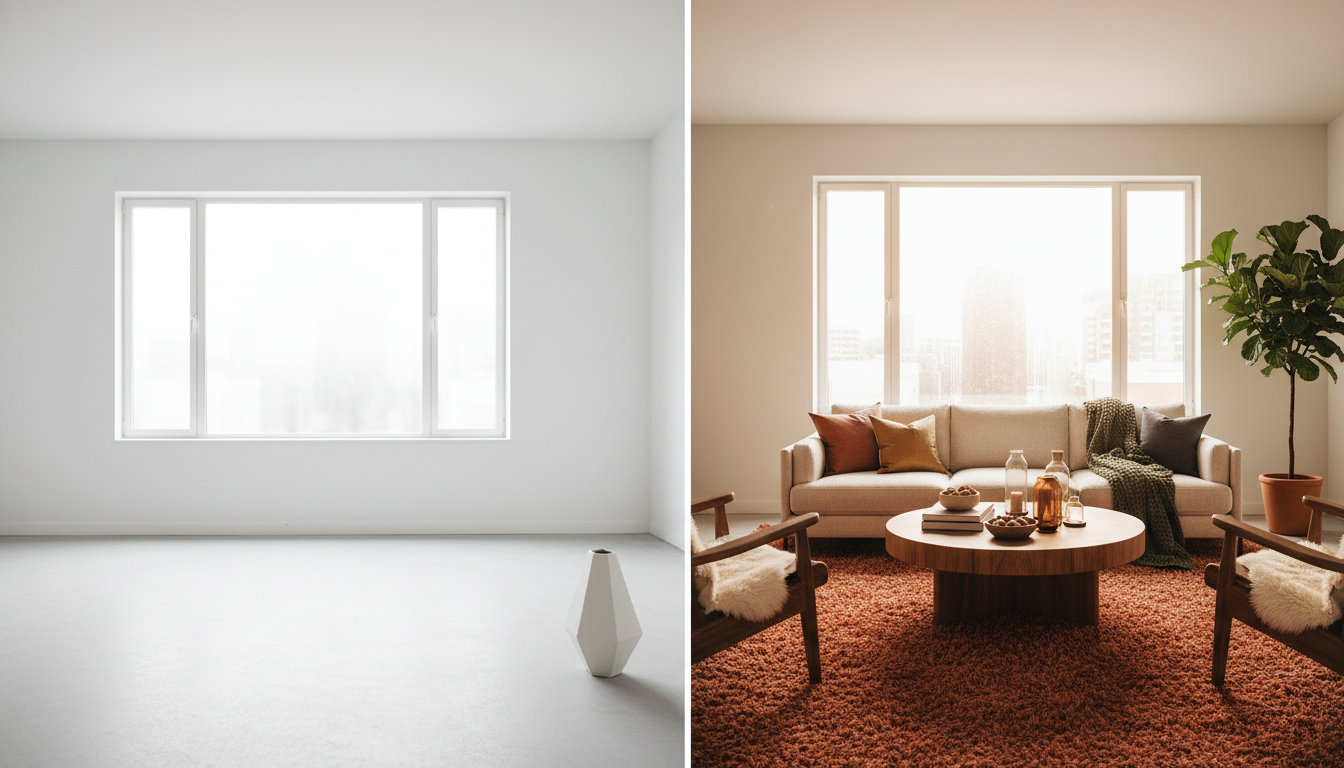
1. The Modern Living Room: Terracotta & Canyon Clay
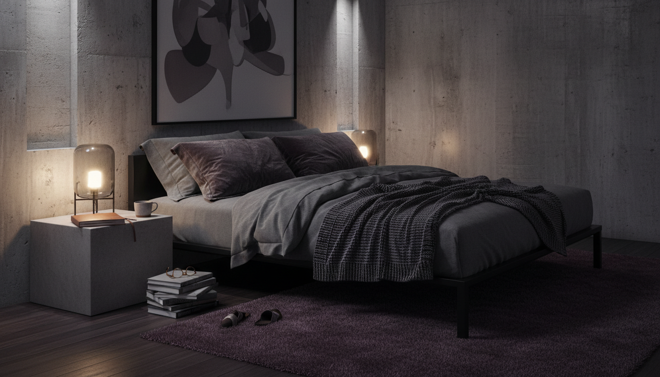
The 2026 living room thrives on “earthy vibrancy.” Instead of a flat, orange-toned rug, look for a saturated terracotta piece that features subtle tonal shifts. This works beautifully when paired with a low-slung, cream boucle sofa and walnut accents. The goal here is to let the rug act as a warm foundation that grounds the lighter furniture above it. Expert Insight: When working with high-saturation earths like terracotta, pay attention to the Light Reflectance Value (LRV). A deeper clay rug absorbs more light, making a large, airy room feel more intimate and “contained.”2. The Sanctuary Bedroom: Deep Plum & Midnight Moss
For the bedroom, we’re moving away from pastels and toward “nocturnal neutrals.” A saturated plum or mossy green high-pile rug creates a sense of luxury that feels like a quiet hotel suite in the heart of London. Choose a rug with a slight sheen—perhaps a blend of New Zealand wool and Tencel—to allow the color to shift as the morning light hits the floor.- The Look: Monochromatic bedding in a lighter shade of the rug’s primary hue.
- The Vibe: Grounded, expensive, and incredibly calm.
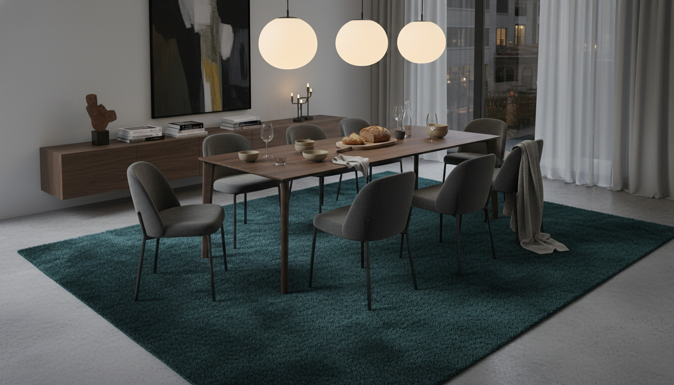
3. The Curated Dining Room: Saturated Ochre & Rust
Dining rooms are often filled with “leggy” furniture—thin chair legs and table bases that can make a space feel frantic. A bold, single-color rust or ochre rug provides a solid visual “pad” that anchors the furniture. In 2026, we are seeing designers opt for hand-knotted textures from the Atlas Mountains where the dyes are slightly uneven, giving the color a living, breathing quality.4. The High-Focus Home Office: Emerald & Teal
Green is the color of cognitive clarity. A bold emerald rug in a home office isn’t just a style statement; it’s a productivity tool. In 2026, the trend is “biophilic saturation”—using colors found in nature but amped up to their most intense versions. Pair an emerald rug with a matte black desk and brass hardware for a workspace that feels authoritative yet creative.5. The Grand Entryway: The Saturated Runner
The hallway is the perfect place to experiment with the “bold color” trend without committing to a 9×12 footprint. A deep teal or burnt sienna runner creates a “runway” effect that pulls guests into the home. Because entryways are high-traffic, look for rugs with a shorter pile height (around 4mm to 6mm) to ensure the saturated color doesn’t trap visible dust or debris too quickly.“The entry rug is the prologue to your home’s story. In 2026, we’re seeing a shift toward ‘chromatic confidence’—using a single, punchy hue to define the transition from the outside world to the private sanctuary.”
— Julian Thorne, Textile Historian and Design Consultant
6. The Urban Pied-à-Terre: Small Space Vibrancy
There is a common myth that bold colors make small rooms feel smaller. In reality, a saturated, earthy rug—like a deep tobacco or copper—can actually “push” the walls out by creating a clear boundary for the floor. In a small apartment, use a rug that covers nearly the entire floor area (leaving only 6 inches of wood showing) to create a seamless, high-end look that feels intentional rather than cramped.7. The Tactile Family Room: Performance Saturated Hues
Family rooms require durability, but that shouldn’t mean boring grey. The 2026 shift toward Bio-Acetate and high-performance recycled fibers means you can have a “juice-box proof” rug in a stunning, deep sapphire or terracotta. These fibers hold onto pigment better than traditional nylon, ensuring the rug doesn’t look washed out after a few professional cleanings.- Styling Tip: Use “color echoes” by placing one or two throw pillows in the exact same hue as the rug to create a cohesive loop for the eye.
- Source: Explore the performance collections at thebohorugs.com for saturated tones that withstand heavy foot traffic and pets.
8. The Indoor-Outdoor Transition: Weather-Resistant Pigments
As the line between the patio and the living room blurs, our rugs are following suit. For 2026, we’re seeing weather-resistant rugs in “sun-drenched” saturations—think faded indigo or clay. These aren’t your typical plastic-feeling outdoor mats. They are woven to mimic the hand of indoor textiles while resisting UV fading, allowing you to carry the bold color story from your lounge right out onto the loggia.Pro Maintenance: Preserving the Vibrancy of Your 2026 Statement

Defeating the Silent Fader: UV and LRV Strategy
One of the biggest threats to a high-saturation rug isn’t foot traffic; it’s the sun. In the design world, we often discuss **Light Reflectance Value (LRV)**. Saturated rugs, particularly those in the **deep plum or forest green** families, have a low LRV, meaning they absorb light rather than reflecting it. This absorption makes them more susceptible to photodegradation. If your statement piece sits in a sun-drenched living room, consider the “rotation ritual.” Every six months, rotate the rug 180 degrees. This ensures that any inevitable mellowing of the dyes happens uniformly, preventing those awkward “tan lines” where a sofa or coffee table protected one section while the rest basked in UV rays. For those sourcing high-end, hand-knotted pieces from thebohorugs.com, this simple habit preserves the integrity of the artisanal wool for decades.The pH Balance of Saturated Fibers
When a spill happens on a neutral jute rug, it’s a minor inconvenience. On a **saturated rust or ochre wool rug**, it’s a potential disaster. The secret to 2026 rug maintenance lies in understanding the chemistry of the fiber. Most premium bold rugs are dyed using slightly acidic processes to lock in the pigment. Using a high-alkaline “all-purpose” cleaner can cause the dyes to “bleed” or “crock.” Always reach for a pH-neutral cleaner. Better yet, stick to the **”blot, don’t rub”** mantra with distilled water and a drop of clear, fragrance-free dish soap. This prevents the mechanical friction that can fuzz the yarn—a phenomenon known as “pilling” that catches the light and makes a vibrant rug look dusty even when it’s clean.“We are seeing a return to ‘slow textiles’—pieces that are meant to age with the home. A saturated rug shouldn’t look brand new forever; it should develop a ‘patina of life.’ The key is ensuring that the patina is graceful, not the result of neglect.”
— Julian Thorne, Principal Textile Historian
Strategic Grooming for High-Traffic Hues
Saturated colors, particularly in high-pile or “shag” textures trending for 2026, show “tracking”—those visible footprints or vacuum lines—much more than their beige predecessors. To maintain a crisp, editorial look:- Disengage the Beater Bar: For daily maintenance, use suction only. A spinning brush can fray the ends of silk or Tencel-blend fibers, dulling the color’s natural luster.
- The “Grain” Check: Just like velvet, rug pile has a direction. Always vacuum in the direction of the nap to keep the color looking uniform and deep.
- Natural Fiber Hydration: In dry winter months, wool can become brittle, causing the tips of the fibers to break off and the color to appear faded. A well-balanced humidity level in the room (around 40-50%) keeps the fibers supple and the pigments looking “juicy.”
Before using any cleaning agent on a saturated rug, perform a “crock test.” Dampen a white microfiber cloth with your cleaner and press it firmly onto an inconspicuous area of the rug for 30 seconds. If any pigment transfers to the cloth, stop immediately. This indicates the dye is “unstable,” and you should consult a professional cleaner who specializes in organic, vegetable-dyed textiles.
Elevate Your Space
Discover the artistry of handmade luxury. Each rug is a masterpiece of tradition and modern design.
Expert Q&A
What are the most popular Bold Color Rugs 2026 trends?
The dominant colors for 2026 include ‘Earthy Vibrancy’ shades like burnt terracotta, mossy olive, and rust, alongside single saturated pigments like deep plum, midnight teal, and mustard ochre.
How do I style a bold rug without it feeling overwhelming?
The secret lies in balance. Pair your bold rug with neutral walls (off-white, soft sand, or light grey) and furniture in natural materials like wood, stone, or linen to let the rug breathe.
Can I put a saturated color rug in a small room?
Absolutely. A bold rug in a small room can actually define the space and make it feel more intentional and cozy. Just ensure the rug covers most of the floor to avoid a ‘floating’ effect.
Does an olive green rug count as a bold choice?
In 2026, olive green is considered a ‘new neutral.’ While it is a bold departure from beige, its earthy undertones allow it to pair seamlessly with almost any other color palette.
How do I match my sofa to a terracotta rug?
For a sophisticated look, choose a sofa in a contrasting neutral like cream, oatmeal, or charcoal. For a bolder, monochromatic vibe, try a sofa in a lighter or darker shade of the same earthy family.
Will bold rug dyes fade in the sun?
High-pigment rugs, especially natural fibers like wool, are prone to UV fading. We recommend using UV-protective window films or rotating the rug every six months to ensure even wear and color retention.
Can I layer a colorful rug over an existing neutral carpet?
Yes, layering a bold accent rug over a neutral wall-to-wall carpet is a top 2026 trend. It adds depth, defines the seating area, and introduces color without a permanent commitment.
What kind of art pairs well with saturated rug hues?
Look for art that ‘echoes’ the rug’s primary color. If you have a deep teal rug, choose a painting with subtle teal brushstrokes to create a visual bridge between the floor and the walls.
Are bold colored rugs practical for homes with pets?
Actually, yes. Saturated, darker, or multi-tonal bold rugs (like rust or olive) are often better at hiding pet hair and minor stains than light-colored neutral rugs.
What rug material holds bold color the best?
New Zealand wool and silk blends are the gold standard for color saturation. Wool fibers absorb dye deeply, resulting in a richness that lasts for decades compared to synthetic alternatives.
Written by TheBohoRugs Interior Design Team
Experts in handmade rugs, boho interiors, and modern home decor.
